I remember buying my first 4k display in 2018. For quite some time I was somewhat dissatisfied with how little difference did it make. That lasted until I bought my first pair of glasses.
Astigmatism allows seeing objects but messes up their details. It's very easy to spot a board with letters at a long distance but reading the words is a much more difficult task. This effect is also noticeable when reading screen content on a laptop.
Since my eye examination I noticed the following changes in my day-to-day life:
- It is much easier for me to consume longer pieces of text, programming code included. And after doing so, I feel much less tired.
- Nobody suspects me of worshiping my computer as I no longer bow to my screen, trying to read small letters. My head is at a healthy distance of at least 60 cm away from the display surface.
- I can use smaller font in my terminal emulator. I can fit up to four vertical splits in vim, each with at least 80 character width. It feels so modern!
All these differences prompted me to seek more quality of life improvements.
Color scheme #
I switched from dark to light theme after reading the following post on UX Stack Exchange: "Dark or white color theme is better for the eyes?". The most important piece for me was of course:
People with astigmatism [...] find it harder to read white text on black than black text on white. Part of this has to do with light levels: with a bright display (white background) the iris closes a bit more, decreasing the effect of the "deformed" lens; with a dark display (black background) the iris opens to receive more light and the deformation of the lens creates a much fuzzier focus at the eye.
But the overall consensus is that light theme is better for everyone's eyes, only sometimes with negligible difference.
This may be an unpopular opinion after dark mode frenzy in recent years and I do get it that this may not work better for everyone. I did note, however, that the most popular argument among my friends for using a dark background is that it produces less bright light which reduces eye strain. I see the point but also found out that tools that reduce amount of blue light1 lead to the same effect for me.
High DPI display #
Before we get into anything, a few clarifications:
- It's actually PPI (pixel per inch). D in DPI stands for "dot" and it does not make much sense in context of computer displays. But let's stick with the popular naming for now. I understand that "PP" doesn't sound very marketable.
- There are only a few displays available that have a proper HiDPI of ≈220 pixels per inch. The most popular are the new Apple displays2 which are crazy expensive.
- Following Android developer documentation, the lower class of screens is called "medium density" and this is what I consider to be "good enough".
27 inch 4k display is the only product category that satisifies the "good enough HiDPI" requirement as defined above. It has ≈160 PPI and is widely available in the market with bonus features depending on the model, such as 120+ Hz refresh rate or High Dynamic Range (HDR).
Having a higher screen resolution may not matter that much for multimedia consumption. But it does matter to font rendering. Having text rendered at a quality matching a well printed book helps with reading as it makes it easier for the eye to distinguish letters. This is why most of the ebook readers, even the older ones, have PPI ranging from 160 up to sweet 300. There are discussions over how much DPI is enough but considering where we are in terms of the available solutions - the sky is the limit.
On a final note: avoid fractional scaling if possible. It usually requires rendering elements at much higher resolution that allows integer downscaling, which may have an impact on performance and battery life. This is particularily applicable to the 1440p displays which at size of 27 inches have ≈110 PPI.
Ergonomic keyboard #
Any ergonomic keyboard and most laptop keyboards are better than what you can see below:
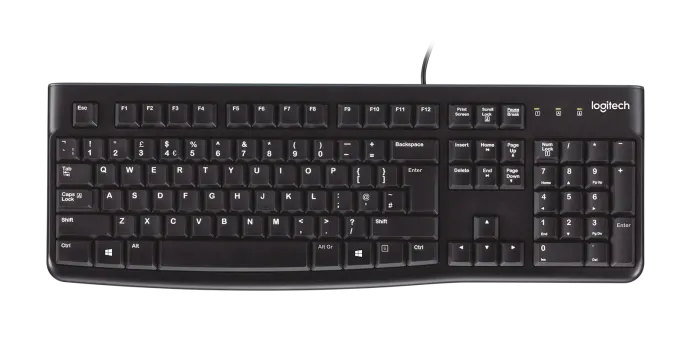
Pain points:
-
Usually, a keyboard is positioned centrally in front of a display. But the main area of usage is shifted a bit to the left (there is commonly no need to use the numeric pad and if you embrace vim - the arrows do not make much sense either). This, in turn, makes a user have their right hand stretched a bit more than the left, which does have an effect on the entire body.
Solution: a 60% or 80% keyboard.
-
Having all the letter keys grouped in one place forces a user to position their hands diagonally. This is not that bad but depending on the length of your hands (the more, the better) may cause either of the following:
- The keyboard is positioned at the edge of the underlying desk, probably close to the belly which may be uncomfortable.
- The keyboard is positioned somewhere on the underlying desk and the user bends their spine so that they may reach it with their short hands.
Solution: a split keyboard.
-
The QWERTY keyboard was designed with typewriters in mind. There is a popular myth stating that the layout was designed in a way that prevents two typebars from clashing. Whether this is true or not doesn't matter. The fact is that we can do better.
Solution: a brain-computer interface because using Dvorak or Colemak layouts in some applications (vim, above all) really sucks.
Ergonomic mouse (duh) #
There are two tools that you must not use to avoid the carpal tunnel syndrome: Emacs without Evil and regular mouse. If you are a gamer - tough luck. But for other purposes just go with a decent trackball. Your wrist will thank you.
Summary #
It took me some time to find products that satisfy my needs. The end result is not only comfortable to use but also pleasant to look at (photo of my desk setup).
I do believe that starting small with undergoing an eye examination is the way to go, even if there is no clear sign of visual impairment. Using more advanced tooling may not give a sense of drastic change immediately. It's rather a long term investment that works like compound interest.
There are always other solutions to improving work environment quality, like quitting a job at corporate and moving to a village so that you may run a farm.